
Here's a visual representation of traffic-related deaths on our highways from 2001 to 2009.
It was created by ITO World, a UK-based transport information company that used data from US government sources.
From a distance, the map shows a broad swath of highway carnage over a 9-year period in which 369,629 people died. Of those, 6,359 were bicyclists.
Zooming in, the story gets personal.
As you scroll in you'll notice the color represents individual boxes. Each represents an individual who died in a vehicle crash. Scroll in closer and you'll see purple (vehicle occupants), blue (pedestrians), yellow (motorcyclists), and green (bicyclists).
Keep scrolling in and you'll see each box tells the sex and age of the deceased, and the year of the fatality.
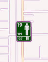 Up close
Just randomly, I started looking around Florida (right) because it usually leads the nation in bicycle fatalities year after year. I stumbled across a location near New Port Ritchey where two bicyclists died at the same intersection two years apart.
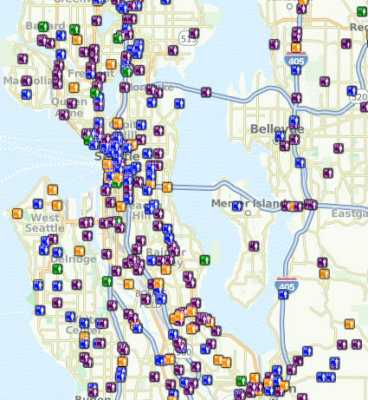 Crossing the continent and zooming in on the Seattle area (left), I recalled many of the bicycle fatalities on the map. But I was shocked by the high percentage of pedestrian deaths shown.
These maps, based on data from the Fatality Analysis Reporting System of the National Highway Traffic Safety Administration, show us that we're our own worst enemies on the road.
Let's hope advocacy groups like League of American Bicyclists, the Alliance for Biking and Walking and state and local bicycle and pedestrian advocacy groups can use this information when they battle to fund safe driving programs.
Traffic-related bicycle deaths, by year
2009 — 630
2008 — 716
2007 — 701
2006 — 773
2005 — 786
2004 — 727
2003 — 629
2002 — 665
2001 — 732
Recent Comments